At the very first, you have to link to the CSS file by speciflying the following if you want to use external CSS:
The basical css syntax looks like this:
To start with the css file, you first specify the whole body area, where you can generally set the background-color, color(color of the text), font(family, size, weight), margin, padding, lineheight(space btw lines, usually use the unit "em"). !ATTENTION dot "." is not needed in front of the body.
A small tip here is instead of saying background-color: red we can always make it short as background: red.
Font families in CSS:
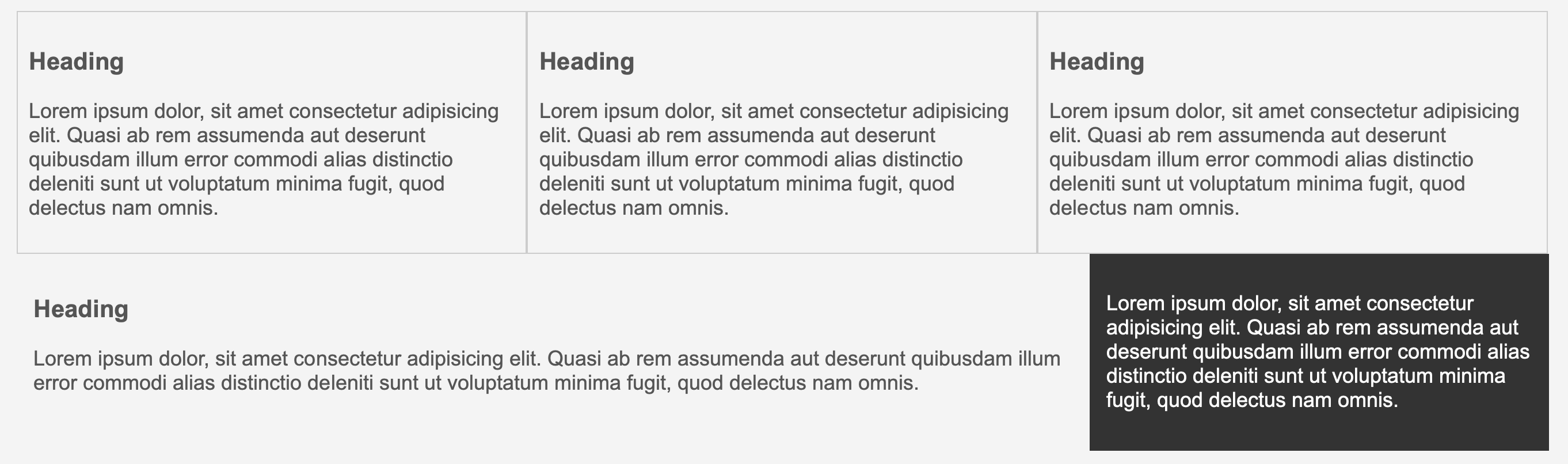
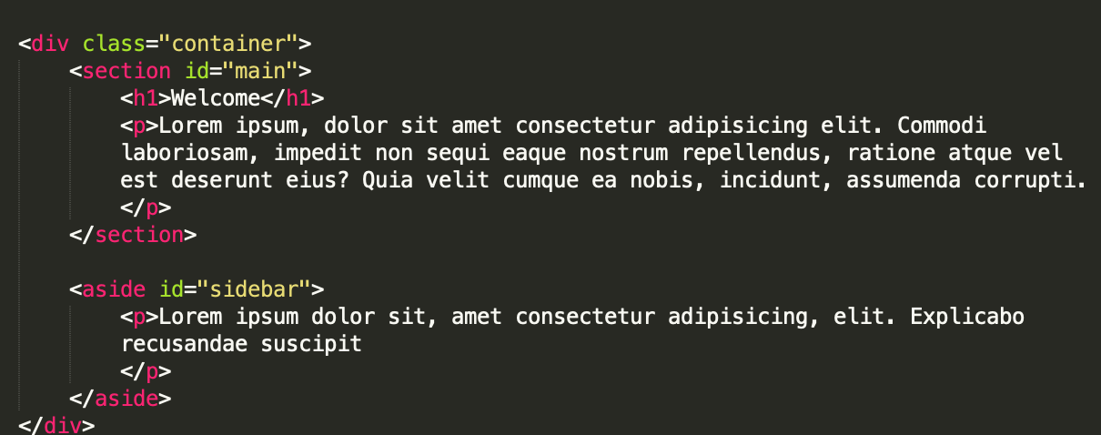
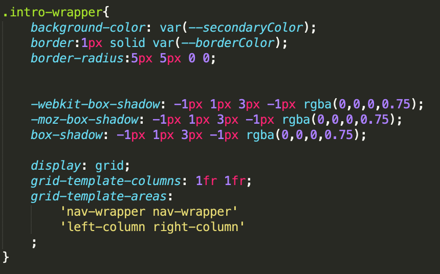
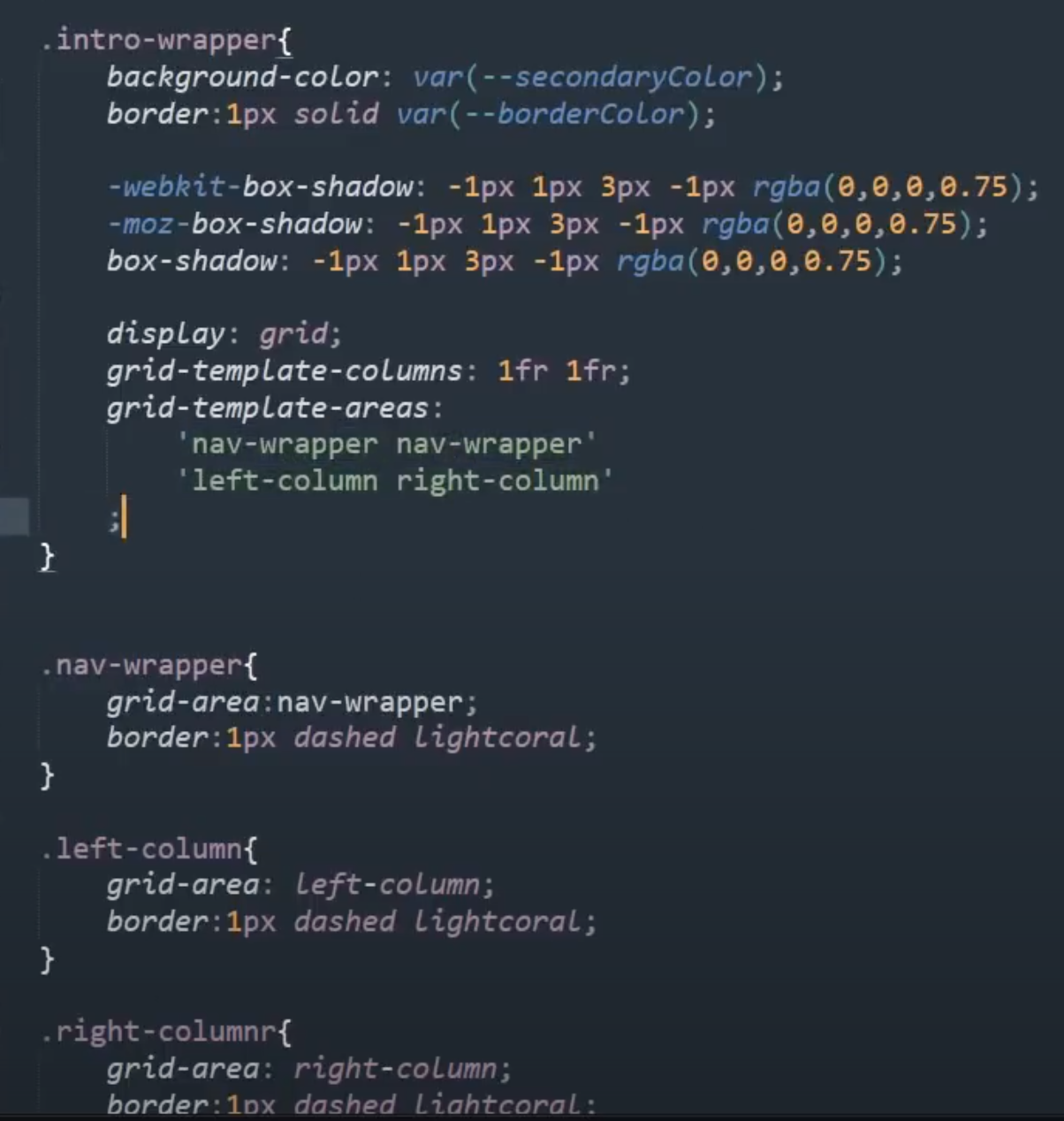
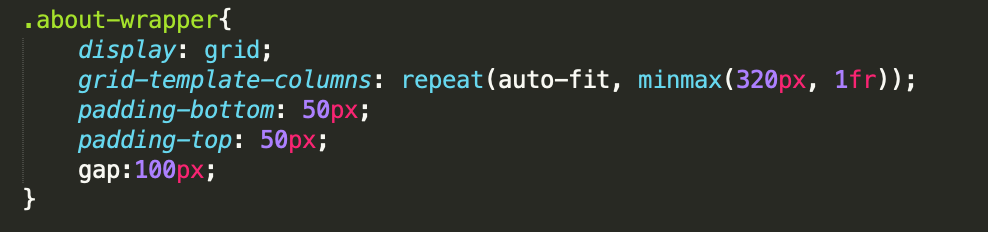
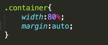
Basically, you might want to put your content in containers. Inside each container, you can still have boxes, categories, forms, list, blocks and etc. Container is like an overall large box which covers all the settings inside it. So within a container, you can set the following attributes: width, margin. 960px is usually the width for a website. However, setting width to a fixed length, will have some problems if you want to make the web window smaller, so it would be beter to set it to a percentage, like: 80%. If you set margin to "auto" it will automatically center the container since auto means setting same margins for left and right. 
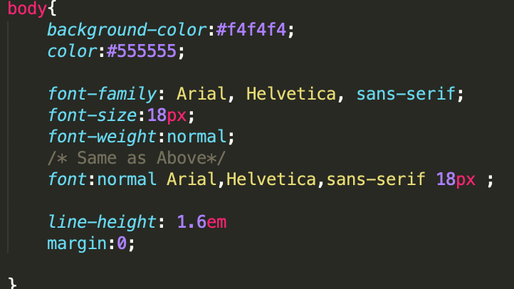
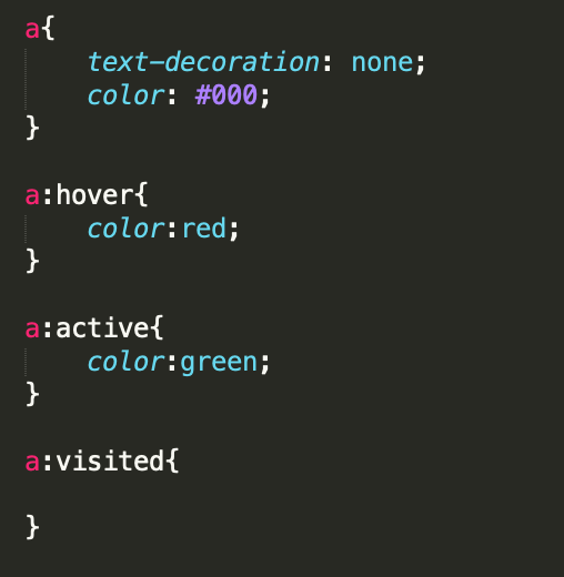
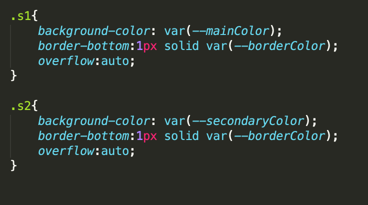
Of course, you can set the colors to those you like as well.
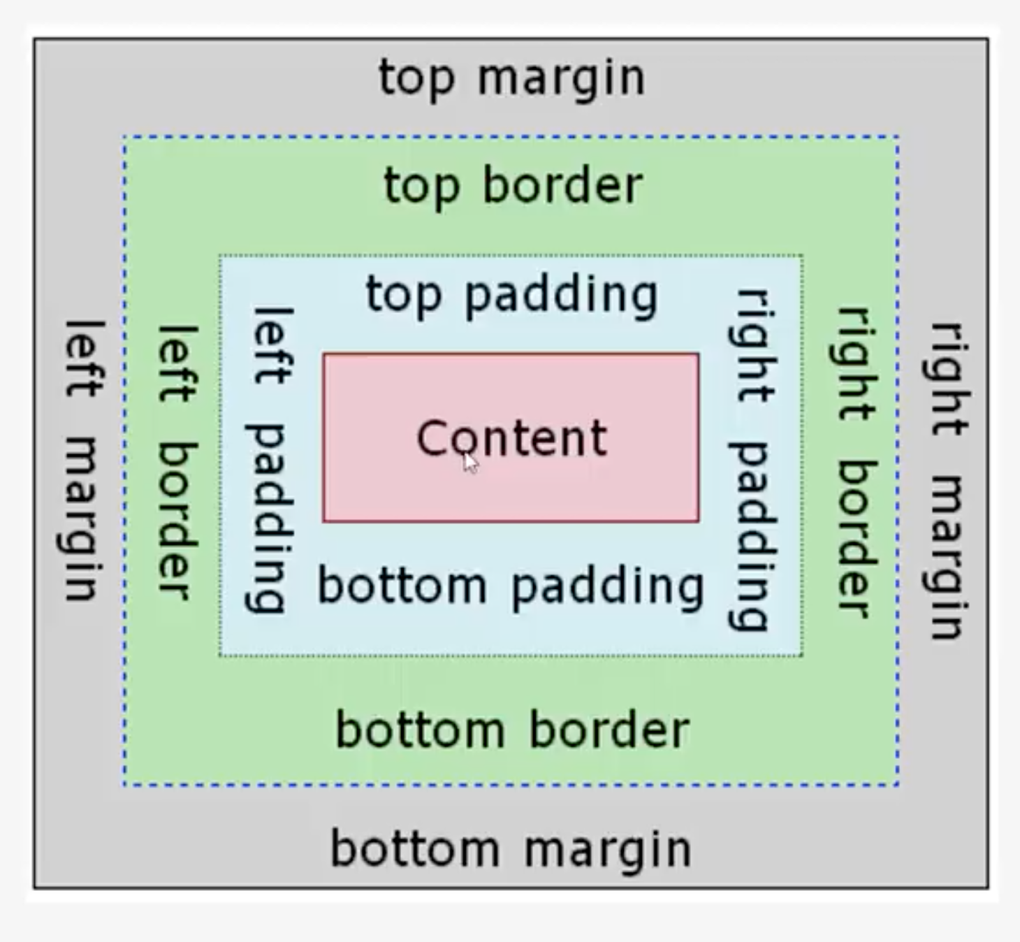
The difference btw margin, padding and border is illustrated as followed
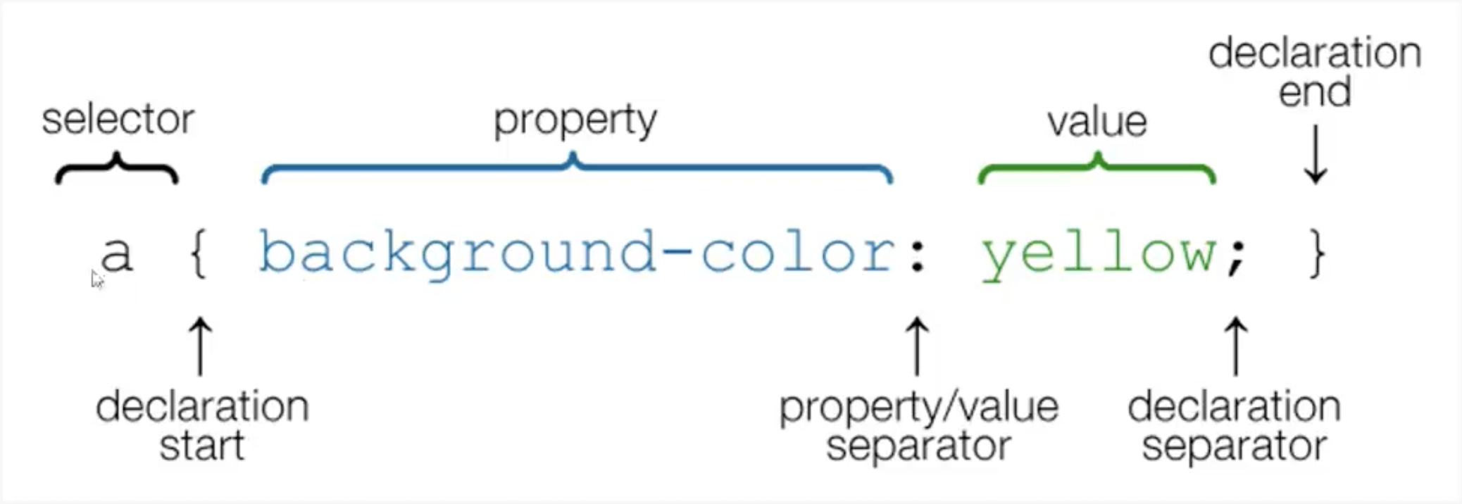
For setting those, there are several different ways:
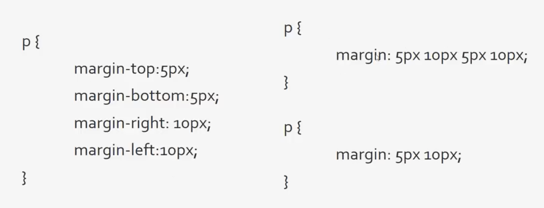
Remember the order from left to right in second case is: top, right, bottom and left. Here is an example:
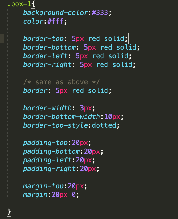
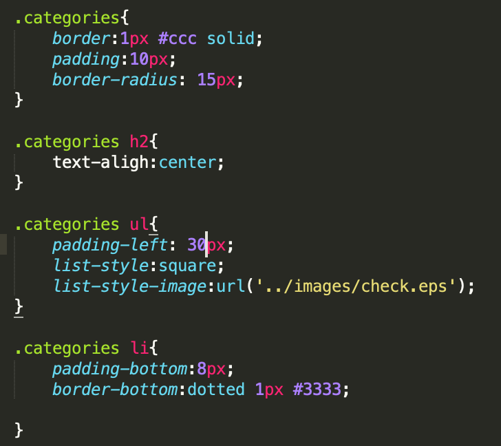
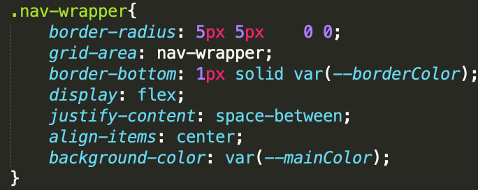
Using border-radius you can make round edges.
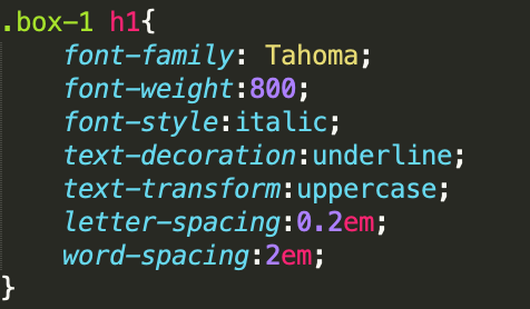
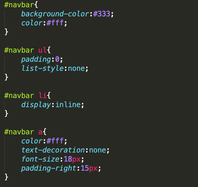
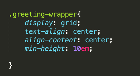
If you want change text style inside some specific container, just specify the name of that container then followed with the text that you want to change. The settings could be font(size, family, style), text-decoration, text-transform, letter-spacing, word-spacing, text-align: center.
First, you can make a category container to hold the lists.
To make a normal list style, you can use following settings: first set list style in .categoty ul with padding, list-style: square or even list-style-image: url(""). And for each list you can set border and padding.
For each list element, you can add an link. Links have some decorations you can do: text-decoration, color. In addition, to have some effect on the links you can do a:hover{color: ...} which will change the color of the item when your cursor hover over it. a: active{color: ...} which will change the color of the item when you click on it. a: visited{color: ...} will change the color of the link if you have visited it before. Above we all used a to refer to the link that we want to set, if some links have been attributed to a class we could also use that class to specify the link. For example, .button:hover{background-color:...;color: ... } if the link has been given a class as "button".
If you want to have a navbar style lists, first you can create a navbar div and make a list inside it. Choose list-style to none in ul; Choose display to inline in li.
Don't forget to add link to each list element and also you can set color, text-decoration, font-size, padding to the link style.
We start with adding some padding to the form area which is classifies as "my-form". And then, use .my form .form-group{padding:...} to add some spave below each form. Use lable{display: block} you can make the label name and the input area separated into different liness.
Apart from that, we can further set the size of each input area. According to the form we have made, the size we want to keep the same are class is input but only when the type is "text" and class is textarea, so we have the following setting:
Use float, you can have you content stay in one side of the page or have different blocks align in the same line. For example, you now have three blocks align on top of each other and you want to make them in the same horizontal position, then you can specify inside the block the following float: left; width: 33.3%. However, if you want to add some paddings or borders, then you might wanna add box-size: border-box which is to ensure that whole box including padding and border will be counted into the 33.3% which is alocated to each block.
Similarly, you can add a sidebar to the main block.
DO REMEMBER to clearit each time you finish using float, otherwise, the content after the floated area would be messed up.
There are 6 types of positions in CSS: static(by default), relative, absolute, fixed, initial, and inherit.
By specify positioin: relative; in the container that you want your elements to be referenced to and position: absolute; for your elements, you can put your elements to any place that you want inside the container.
You can also add background images to the containers using background-image: url('') and you can change the position of that background by background-position, you can use either e.g. 100px 200px or strings like center top. The background image will by default repeat itself if it is too small to fit the whole container, but you can choose to disallow that by setting background-repeat: none.
To have a element fixed on certain position of the screen, you can use position: fixed and then specify the postion that you have in mind, like top: 400px.
Attention here, the floating element has two classes class="fix-me button", you can do it just by put them along to each other.
You can use pseudo classes as selector to change certain elements, they could be certain paragraphs, items, etc... Make sure do not leave space between li: and the following childstuff.
If you wanna change the size of the container if the size of window changes so that the text could not fit in the container, you can use min-height: in the container.
When you have several floating area sit next to each other and you want them to line on top of each other if the window's width becomes too narrow, you can use @media(max-width: ){} as in the following example:
Use :root{--name:} at the begining of the CSS file to create certain variables that you would like to use (var(--name)) later in the context.
Since it seems containers are not allowed for pseudo classes, to make colors different every second second, use repeated class names like:
If you don't like the fonts provided by defaulf, you can use online google fonts. You just go search for google font and select the one that you would like to use. Then on the right side of the webpage, copy the link to put it on your html file just below title, meta. And copy the names to the place that you want to use them.
To center the text in the middle of the container horizontally: text-align: center or justify-content: center; vertically: align-content: center.
Use display: flex in the container that you want your elements aline. The effect is similiar to float. In addition to flex, you can use grid as well. The syntax might be a bit different but you can get the same effect. Read more about flex and the difference between the two.
Use width, height to set the size of picture. If you want your picture not being distorted, then use object-fit: cover. Since image is an inline element, so if you want to make it centered, you could first make it as a block element by display: block then use justify-content: center.
Use grid-template-columns: repeat(auto-fit, minmax(320px, 1fr)). By the way, you can use gap: 20px to seperate the blocks between grids.